Terrascout / Menswear, footwear & bags

A wardrobe with
somewhere to go.

Terrascout was a menswear brand for a life that moves between work, travel and time outside. I wanted a wardrobe that felt considered in the office and at ease in the field, with attention to proportion, fabric and detail.

I founded and self-funded the company, directing the collection across apparel, footwear and bags. The work ran from sourcing fabrics from Japanese mills and producing apparel in Los Angeles to the identity, campaign and place where the collection was sold.

I was responsible for what we made, how it was made and the inventory I committed to fund.
Rob Williams / Founder / Apparel, footwear & brand direction

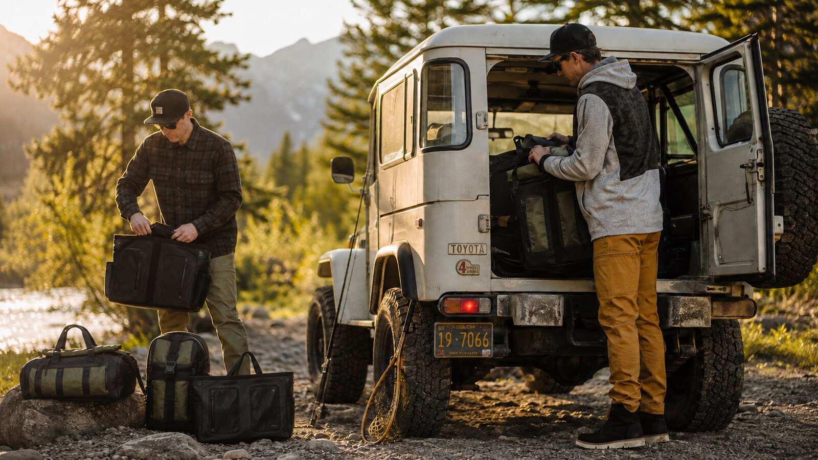
Two men loading Terrascout bags beside a vintage Toyota FJ40 by a river in the mountains.
Terrascout / Out in the field

Apparel design

Designed to be worn together.

I began with complete looks: wool shirtjackets, anoraks and utility pants considered alongside footwear and bags. Olive, charcoal, navy and warm neutrals connected the range, with plaid, texture and material blocking giving individual pieces their character.

Development carried those choices into fit. The anorak’s half-zip front, side access and panel construction were worked around movement. The utility pant brought the same attention to proportion and storage for travel and daily wear.

Japanese fabrics. Los Angeles production.

Much of the apparel fabric was sourced from Japanese mills, including cotton ripstop and wool for shirtjackets. I selected every fabric, lining and piece of hardware, chose the Los Angeles factory and led the fit sessions through production.

Sourcing, fit and construction were part of the same design responsibility. The collection had to hold together in the clothes themselves, as well as in the sketches.

The complete look / Plaid shirtjacket, pant and ankle boot

Footwear design

Work-shoe roots. Everyday purpose.

The footwear began with the straightforward construction of a work shoe. I developed that starting point through slip-ons and ankle boots, using leather, elastic entry and a light wedge sole for the more structured boot.

Leather and suede, dark and natural colors, and two outsole directions gave the range different expressions. Each version was considered with the clothing around it, keeping the footwear part of the wardrobe rather than a separate collection.

Footwear / Ankle-boot color and material variations

Everyday carry

Keep it within reach.

The backpack and duffel carried the collection’s material contrasts into bags. Black pebbled surfaces, olive technical panels and exposed hardware connected them to the clothing through color, texture and detail.

Access shaped the duffel. Exterior zip pockets made organization part of its appearance, while durable handles and a simple cylindrical body kept the overall form straightforward. Its useful parts gave the bag its character.

Duffel / Exterior storage, materials and hardware

Brand strategy & identity

A point of view before a mark.

The brand began with the person wearing the clothes and the life around them. References for places, materials and useful objects established a character that could move between work, travel and time outside. That direction informed the collection, the identity and how both were presented.

I developed the name and geometric mark in my notebook, refining them for use on a clothing label or across the side of a shop. The geometry extended into patterns, product graphics and the retail environment. Labels and hang tags carried the product’s name, materials, color and story.

Terrascout / Wordmark and geometric mark

Brand in the field

The life around the clothes.

The campaign placed the collection in the travel and time outside that had inspired it. Driving, gathering beside a river and moving across rocky ground gave the clothes a setting beyond the studio.

On a person, the relationship between the pieces became visible: the length of a jacket, the cut of a pant, the texture of a layer and the footwear beneath it. The setting supplied the atmosphere; the clothes remained the subject.

Terrascout / On the road

Retail & merchandising

The collection, in person.

The mobile shop brought apparel, footwear and bags into one place. The collection could be seen together, with its colors, materials and proportions carried into the displays around it.

I designed the trailer from the exterior and floor plan through to the interior and merchandising. It was a working prototype of the complete brand experience: a place to test, feel and refine the vision, and a way for potential investors to experience it in person.

Terrascout / The mobile shop at twilight

The business

I launched Terrascout in 2020 as a self-funded, profitable business. Alongside the design, I was responsible for fabric orders, manufacturing, inventory and selling.

Growth required more investment in stock. I turned down outside funding and chose not to keep financing that growth myself.

Founder, apparel, footwear and brand direction / Rob Williams.

Terrascout / My role

The collection, from direction to delivery.

I founded and self-funded Terrascout, directing a menswear collection across apparel, footwear and bags. I designed the identity and developed the website, campaign and mobile shop around the range.

Much of the apparel fabric came from Japanese mills, including cotton ripstop and wool for shirtjackets. I selected every fabric, lining and piece of hardware, chose the Los Angeles apparel factory and led the fit sessions through production.

I also held responsibility for fabric orders, manufacturing commitments, inventory, merchandising and selling the products. The mobile shop made the complete brand experience tangible, both as a place to test and refine it and as a way to show the vision to potential investors.

Terrascout / The story

Designing the way the wardrobe feels.

The outfit was the starting point. I explored silhouette, material blocking and color together, considering how a jacket would sit over a pant and how footwear would complete the proportions. The aim was a wardrobe with an understated character and enough ease for a day that could change direction.

Much of the apparel fabric was sourced from Japanese mills, including cotton ripstop and wool for shirtjackets. I selected all the fabrics, linings and hardware, carrying the material direction across the range.

I led the fit sessions to refine proportion, movement and access. On the anorak, that meant considering the half-zip front, side openings and pocket placement together. The utility pant brought the same attention to the cut of the leg and the relationship between storage and silhouette.

I chose the apparel factory in Los Angeles and carried the design into production through fabric, construction and trim specifications. The goal was to preserve the character of the original outfit through the decisions that made each garment real.

Terrascout / The story

The outfit, from the ground up.

The footwear was designed in relation to the clothing. The weight of the sole, the height of the upper and the contrast between materials all contributed to the proportions of a complete outfit.

Slip-ons explored the simplicity of a work shoe. The ankle boot developed a more structured upper with elastic entry and a light wedge sole, giving that familiar construction an everyday role.

Leather and suede studies, dark and natural palettes, and two outsole directions let me explore different expressions of the same wardrobe.

Terrascout / The story

Make access part of the design.

The bags developed as a family, sharing materials, hardware and straightforward access points. Their black and olive surfaces carried the apparel direction into soft goods.

Exterior organization gave the duffel a clear structure. Contrasting zip pockets, durable handles and a cylindrical body made its function visible.

Terrascout / The story

From a way of living to a visual language.

The creative direction brought together the life around the products and the character of the products themselves. References for people, places, materials and useful objects helped establish a shared point of view for the wardrobe and the brand.

Naming and sketchbook exploration came first. Golden-ratio construction studies gave the triangular geometry a framework; further drawing refined the relationship between the mark and the wordmark. Digital studies then tested badges, lockups and color.

The resulting geometry extended into patterns and product graphics. Hang-tag specifications, woven labels and size tabs translated that direction into the small, practical details of a finished product.

Terrascout / The story

Give the wardrobe a life outside.

The campaign focused on travel and time outdoors. Vehicles and landscapes gave the collection a setting, while the clothing remained part of the activity.

Photographs of the pant in motion revealed the proportions and storage. Outerwear images showed how the paneling, materials and silhouette read on a person. Together, they gave the product photography a wider context.

Terrascout / The story

A place to experience the whole brand.

The mobile shop was a way to make the ambition tangible. Rather than asking potential investors to imagine a brand from separate products and drawings, I could show how the collection, identity and environment belonged together.

I worked from notebook plans and exterior studies through the floor plan, interior and product displays. The dark exterior framed the collection; inside, geometric wall graphics, suspended rails and shelving translated the identity into the way the products were presented.

The space brought the design decisions into real use. Proportions could be felt, materials handled and complete outfits seen together. It was built to test and refine the full experience of Terrascout, with the collection and its setting considered as one.